User Experience Design in eCommerce: From Browsing to Checkout

User Experience Design in eCommerce: From Browsing to Checkout
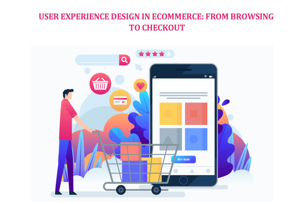
Imagine your customers browsing your product pages, captivated by intuitive navigation and eye-catching visuals. Product descriptions are clear and engaging, while personalized recommendations offer tempting whispers of desire. Investing in good user experience (UX) design isn’t just about aesthetics; it’s about optimizing every step of this journey. UX design is crafting seamless and enjoyable interactions between people and products. In the realm of e-commerce, it translates to guiding your customers through a smooth and satisfying journey from the moment they land on your page til post-purchase.
In this article, we’ll explore UX design in ecommerce, beginning with the benefits of a good UX design. We’ll move on to landing pages and first impressions, browsing and discovering the perfect product, the checkout process, and enhancing the post-purchase experience. Read on to learn more about these topics!
Benefits of a Good UX Design
The benefits of investing in a good UX design are undeniable.
● Increased conversion rates
● Enhanced brand loyalty
● Growth in revenue
● Reduced bounce rates
● Increased engagement
● Stronger brand image
● Sharper competitive edge
● Improved website analytics
● Boost in accessibility
● Streamlined operations
● Enhanced SEO potential
These are just a few advantages of investing in your website’s UX design. With these in mind, you’ll also want to improve your ecommerce website’s UX design.
Landing Pages and First Impressions
The landing page is the digital doorstep of your e-commerce store, the first impression that sets the tone for the entire shopping experience. Here, you capture attention, ignite curiosity, and pave the way for a smooth journey. This section discusses the key elements that create a memorable first impression.
Visually Appealing and Intuitive Design
Imagine your landing page as a well-composed photograph. You should create white space on the landing page, helping guide the eye towards crucial elements. Avoiding clutter, prioritizing hierarchy, and letting your brand’s visual identity shine through are vital.
Captivating visuals are there to help you. Think of stunning product photography, inspiring lifestyle shots, and videos that bring your offerings to life. Remember, visuals should be relevant, high-resolution, and optimized for fast loading.
Every click, scroll, and tap should feel effortless. Intuitive navigation menus, familiar button placements, and consistent design language are necessary to create a sense of ease and familiarity.
Search and Navigation
The search bar is one of the most crucial elements of your landing page, so you need to make it accessible, prominent, and intelligent. This intelligence means that auto-suggestions and relevant results anticipate user intent. It prevents frustration and directs them towards their desired products.
As you’re categorizing products, think in terms of user expectations. Categorize your offerings logically and intuitively. It would help if you used helpful labels, subcategories, and easily accessible filters to refine the search and surface relevant options.
You need to consider banners for your product pages, too. Display your top products, new arrivals, or seasonal offerings with the banners. You can feature curated collections through visuals and descriptions, enticing users to delve deeper into specific categories.
Browsing and Discovering the Perfect Product
Once past the landing page, customers focus on finding the perfect product for their needs. UX designers have the job of equipping customers with the tools and experiences to make their search successful. In this section, we’ll talk about transforming browsing to allow customers to discover the perfect product for their needs.
Engaging Product Pages
High-quality, multi-angle photographs and videos are your secret weapon for engaging and attractive product pages. They allow you to display the products in action, highlight details, and let customers virtually hold them in their hands. You should consider 360-degree views and zoom options for ultimate product immersion.
Product descriptions have an essential purpose: informing the customer about the product’s details. So, highlight key features and benefits that resonate with your target audience. You must address their pain points and spark their imagination with storytelling elements. You can also integrate customer reviews, ratings, and influencer endorsements to instill confidence and nudge users toward purchase. Showcase real-life usage through UGC photos and videos for added authenticity.
Refining the Search
For the search, you need to keep accuracy and relevance in mind. Ensuring relevant results is critical, even for misspelled queries or vague keywords. You must use synonyms and understand user intent to guide them towards their desired products.
Filters are a necessary facet of the search function. They enable users to narrow down their options with ease. Sort filters by color, size, brand, price range, and other relevant criteria. You must make them intuitive and visually appealing and allow for multi-selection to personalize the search experience.
For a more interactive experience, go beyond static images. Virtual try-on tools for clothes and accessories, augmented reality room simulations for furniture, and interactive product configurators add a layer of fun and engagement to the discovery process.
The Checkout Process
As users approach the point of purchase, they have a few questions in mind. Will this product truly fulfill their needs? Is the purchase process safe and convenient? Here, you must bridge the gap between curiosity and conviction, showing your commitment to transparency, security, and ease. This transforms hesitant browsers into confident buyers.
Building Confidence in Your Offerings
You can build customer confidence in your offerings by presenting comprehensive product information that leaves no detail hidden. Specifications, size charts, material descriptions, and care instructions empower informed decisions and minimize uncertainties. Clear availability indicators and accurate shipping timelines set realistic expectations and mitigate anxieties. Real-time order tracking is another vital component, fostering trust and engagement throughout the delivery journey.
Going further, you need to reduce security concerns. For this, use secure payment gateways, prominent SSL certificates, and readily accessible return policies. Making customer support information readily available demonstrates your commitment to resolving any issues efficiently.
Minimizing Friction
You should consider offering a single-page checkout option for a focused, streamlined experience. Minimizing clicks and unnecessary pages will ensure a smooth, uninterrupted flow toward completion.
Customers prefer a quick checkout process. For this, you should allow guest checkout alongside existing account login options for returning customers. A variety of secure and trusted payment methods will appeal to users as it accommodates their varied preferences.
Transparency is a crucial step in the checkout process. Ecommerce store owners should display the total cost upfront and prominently, including taxes and shipping charges. Avoiding hidden fees or surprises at the final stage will foster trust and prevent cart abandonment.
A tip for smoothing this process is to use the Request a Quote Plugin for WooCommerce to give customers the option of personalized pricing for complex or customizable products.
Finally, it would help if you made checkout forms intuitive and easy to navigate, with clear labels, validation checks, and progress indicators. Confirmation emails and order summaries will solidify the purchase and provide a sense of closure.
Enhancing the Post-Purchase Experience
The journey doesn’t end with a confirmed order. In the world of e-commerce, the post-purchase phase is a golden opportunity to transform fleeting transactions into enduring relationships. You can turn satisfied buyers into loyal advocates by fostering delight and nurturing trust.
A Seamless Post-Purchase Journey
Clear communication is critical for a seamless post-purchase journey. A detailed order confirmation page with accurate product information, delivery timelines, and tracking numbers establishes transparency and minimizes anxieties. You can keep customers informed with proactive updates on order status, from processing to delivery.
Easy access to return and exchange policies, presented with minimal hurdles, fosters trust and demonstrates customer-centricity.
Building Loyalty and Advocacy
You can go beyond automated emails by crafting personalized thank-you notes with targeted recommendations based on their purchase. This small gesture shows appreciation and keeps the conversation going, encouraging further engagement.
Reward customer loyalty by implementing loyalty programs with exclusive perks and incentives for repeat purchases.
Also, create referral programs to turn customers into advocates, thus expanding your reach and fostering a sense of community.
Conclusion
In the ever-evolving landscape of e-commerce, user experience design (UX) cannot be relegated to just an afterthought. It is the lifeblood and heartbeat of your online store. Every element, from captivating visuals to intuitive interfaces and streamlined checkout flows, is an opportunity to cultivate trust, foster delight, and secure the loyalty that fuels long-term success. So, embrace the power of UX design. Go beyond the transaction and make the journey as captivating as the destination. You’ll watch your website soar on the wings of success.


This design is steller! You obviously know how to keep a reader amused. Between your wit and your videos, I was almost moved to start my own blog (well, almost…HaHa!) Wonderful job. I really enjoyed what you had to say, and more than that, how you presented it. Too cool!